


Project Overview
Bringing the story of Sydney’s water supply alive was the overall goal for the project. The former SCA website was arid. Our early research highlighted information was hard to find, users were frustrated and lost in a website architecture which served up an internal organisational perspective.
The new site needed to connect with the broad interests of Sydney residents and answer the very specific needs of our key users. The new architecture aims to connect our time-poor stakeholders quickly with what they need. We also wanted to tempt users to explore a little more, sharing with them the fascinating world of water (we already knew they were thirsty for knowledge…each time Warragamba Dam spills after rain, we can have up to 75,000 web visitors a day). Data became the centrepiece – interactive and visual – answering answer information needs.
This new website takes a user-centred approach to deliver the results we were looking for: to focus on our users and community and their online tasks and goals; create immersive experiences; open up access to our data; offer better quality information and improved online services to address the needs of each audience group.
Organisation
Team
Sydney Catchment Authority (SCA) engaged a number of separate agencies with leading expertise for key components of the 12-month web redevelopment project. We avoided working with a one-size-fits-all company which could potentially have had a deficiency in a key area of the project.
Stage 1 (October 2012-February 2013) involved online survey and face-to-face consultation including interviews and focus groups involving 250-plus SCA web users and stakeholders. We engaged a specialist user experience team to develop initial concepts and basic wireframes which were then tested with user groups and further refined. Integral to the success of the project was the development of personas for our web users (fleshing out characters we weren’t even previously aware we had been servicing). They ranged from Rob the retired engineer (affectionately known as the ‘dam nut’), to Dallas the day-tripping dad and Clara the council officer and Bec the busy postgraduate student. Final wireframe walk throughs were conducted for key audience groups as a final check.
While our research focussed primarily on the needs of our external users, we knew that our own staff also had specific requirements and useful ideas for improvements. To make sure they were engaged throughout the process, we set up a website redevelopment working group with representatives from across the organisation, met regularly with key executives, and gained broad staff input into web user personas on our web design wall (see images).
Between March and April 2013, a graphic and web design agency was engaged to bring alive the web concepts with vibrant design. Soon after, Stage 3 commenced with the SCA working with a web developer to carry out the build of the new site on the Matrix CMS platform between April – September 2013. Considerable refinement of the wireframes and interactive tools was further undertaken during this phase of the project. Content creation was undertaken throughout 2013 and the site was populated August – October 2013. The new site was launched in late October 2013.
Project Brief
It was an ambitious brief we gave to our developers. Upfront we wanted to provide a rich and rewarding web experience that extended people’s knowledge about water, while ticking the boxes with key users with very specific tasks and needs.
We wanted to move 69% of users, who previously came only for dam level data, onto other related content areas in the website. At the same time we needed to address issues identified in the research – eg technical jargon, difficult to find documents, lack of information on key topics, not engaging content - with a fresh approach to content and architecture.
Our own business needs required more online self-service with reduced phone inquiries and at the same time we wanted to promote open data initiatives by sharing more spatial information and scientific research. As a NSW government agency we needed also to meet WCAG 2.0 AA legislative requirements.
The brief focused on three central approaches: Dam levels to remain the core part of the site – but automated, daily and interactive. Dam visitor information to offer a tourism-focused, rich and interactive content area. Highly task-specific content developed for key stakeholders and specialist audiences.
Project Innovation/Need
How did we achieve these lofty ambitions? We opened up access to our information, data and services not previously provided before. Where possible, we wrapped these new offerings up in an interactive and engaging format. For example:
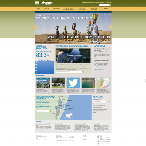
*Automated daily data presented in both interactive formats and engaging infographics. The website was linked to in-house water supply databases (11 dams including historic data), rainfall (five regions), and environmental flows. For example www.sca.nsw.gov.au/water/dam-levels
*Visit a dam content (11 sites) balances the need for promoting visitor experiences (including video and photo galleries, interactive “view water supply” schematics) with restrictions, booking and logistical information. For example www.sca.nsw.gov.au/water/visit/warragamba-dam
*Where does my water come from? Ability for 4.5 million Sydney residents to locate where their drinking water comes via postcode look-up and interactive mapping (See homepage map).
*Let me explore and learn - interactive learning tools for students, catchment residents and history buffs. For example - water supply timeline; how it all works (interactive mapping); Your part of the catchment (linking catchment residents to their local area); Mystery heritage object tool.
*Engagement and online response tools – six new feedback mechanisms to drive engagement, applications and submissions
Design Challenge
The key challenge was overcoming ‘signal static’, that age-old problem for government agencies trying to service multiple and varied audiences with just one website. Our research and analytics were critical to the solution. The central concept for the website was established using our audience’s mental models to create four pathways to information based on TASK, TOPIC, LOCATION and ROLE of the user.
For five key roles we created dedicated portals for our “visitors”, “landholders and residents”, “teachers and students”, “councils and developers” and “history buffs”. We tailored content and a user experience for each of them.
We used interactive mapping throughout the site to create portals based on geographic location. This answered “what’s happening in my backyard” requested by our 220,000-plus urban and rural residents across the catchment.
We created a task-based menu that also educated users what they could do on the site. These innovations to the design and architecture complemented the more traditional approach to topic-based navigation which we simplified and enhanced. The usability was improved by mega menu displays, allowing users to quickly see all options visible and satisfy their goal oriented motivations.
User Experience
The total number of visitors to www.sca.nsw.gov.au has never been a meaningful indicator for the website. Short and longer-term weather conditions – rainfall, floods or periods of drought – see visitation fluctuate between 300,000 to 650,000 per annum.
The more relevant statistics relate to behaviour and visitor experience. These highlight major successes of the new website in achieving our goals:
* 79% increase in average time a visitor spends on website (rising to 2 mins 18 seconds which is fairly high by industry standards)
* 223% increase in average time users spend interacting with main dam level data page (rising to 1.17 seconds)
* 23% reduction in users exiting the site immediately after viewing dam level data
* 9000%+ increase in community engagement and response – 2771 queries, applications and submissions via the site in first six months in contrast to a few hundred on the former website.
The move to automated data published reduced in-house resourcing at the SCA by a minimum 80 hours per year. The new website has also been integrated into lesson plans for over 7,500 students who attend excursions to Warragamba Dam every year.
Tags
Digital Experience - Website
This award celebrates innovation and creativity in design of a unique user experience in the combination of text, audio, still images, animation, video, and interactivity content for websites. Consideration given to clarity of communication and the matching information style to audience.
More Details