
|
|
Project Overview
Yellow Pages® is one of Australia’s largest business directories, with millions of Australians using it to find and connect to businesses every month.
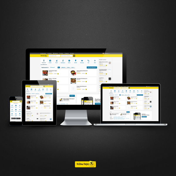
Faced with an ageing mobile site not designed to cater for modern devices, Yellow Pages® made the decision to create an entirely new web experience for our users. Employing responsive web design, we not only replaced our mobile site but created a fully unified Yellow Pages® user experience across mobile, tablet, and desktop.
Organisation
Team
Luke Meehan - Producer
CP Lim – Development Lead
Jackie King – Test Lead
Ben Gilmore – Principle Designer
Robert Wijaya – Visual Designer
Shibu Ram – User Experience Designer
Glenn Thomson – Business Analyst
Teresa Huang – Business Analyst
Abhishek Iyer - Designer
Adrian Kelly - Developer
Adrien Barbier – Developer
Anthony Damtsis - Developer
Alvin Tan - Tester
Becs Abriam – Developer
Bertrand Le Foulgoc - Developer
Chris Balogh - Developer
Dale Wu - Developer
Felix Satyaputra - Developer
Hoang Phan - Tester
Lisa Yang - Tester
Linh Pham - Developer
Mike Farah - Developer
Natalie Wong - Tester
Richard Fyffe - Developer
Robert Parsons – Senior Developer
Sergey Marakhov - Developer
Son Chau - Developer
Steven Cooper - Tester
Taras Filonenko - Developer
Thomas Lu - Developer
Travis Dixon - Developer
Trung Le - Developer
Tony Wilson - Tester
Project Brief
Yellow Pages® is where Australians go for local business information, and with the rise of mobile usage across our sites, Yellow Pages® needed a first class experience for all mobile and tablet users.
With this in mind the team set out to create a modern user experience that catered for the growing spectrum of devices in market. The site needed to present information in a way that made it quick and easy to find and connect to businesses.
Working within the limitations of small screens and 3G data connections, the new site also needed to treat mobile users as full web citizens, addressing the lack of feature parity between the existing mobile and desktop sites. Each feature of the site needed to be assessed and redesigned to work across all devices.
Finally the new site needed to be able to deliver new features across all platforms in a market where new devices are announced weekly. We needed a site that supported an increasing number of internet connected devices and screen sizes in a way that made future development faster.
Project Need
The answer to this brief was a standards compliant responsive website that would replace both the mobile and desktop sites with a single unified experience.
Harnessing the power of modern devices, we used HTML5 and geo-location to allow consumers to see businesses around them on a map and get one click directions*.
Taking full advantage of CSS3 styling allowed us to use progressive enhancement to create a clean user interface that loaded quickly.
Creating a user experience that was familiar, easy to use and distinctively Yellow Pages® across all channels was important and the use of web fonts for brand typography and iconography ensured features were recognisable across platforms, lowering any learning curve for users.
New features like popular searches, ratings and reviews and content like opening hours and distance from current location were designed to make it quick and easy to search for and select businesses.
The ability to share business information or call a business with a click* makes the process of contacting a business simple.
The end result - a content rich, unified Yellow Pages® interface across mobile, tablet and desktop that allows consumers to quickly and easily find and connect with a business.
*On devices where appropriate features are enabled
User Experience
Redesigning Yellow Pages® for responsive technologies was a major undertaking, with the challenge being to produce a usable design that was both fast and provided the depth of content consumers were looking for when searching for a business.
Adapting individual UI elements to break points where the design element looked sub optimal, (rather than having a predefined set of break points) produced a flexible solution where elements adjusted layout independently of each other, ensuring a premium experience tailored to device.
Other major considerations surrounded how easily consumers could then use or share business information. Building in single click-to-action functionality allowed consumers (dependant on the device) to quickly get directions to, call, email, save or share business information and contact details.*
Considerable UX testing (consisting of traditional lab based, multiple rounds & remote user testing) was conducted throughout the development process to ensure the design delivered a great user experience at any size, on any platform.
*On devices where appropriate features are enabled
Project Marketing
N/A
Best Audience Migration to Mobile Technology
This category recognises migration of an audience from a traditional media to a mobile platform.
More Details