


|
|

Project Overview
London underground map redesigned for easier viewing by people with all forms of colourblindness, and other vision impairments such as cataracts, loss of contrast sensitivity and myopia. If you have difficulty using the London tube map, this could be the answer.
-Official licensed London tube map
-Designed for and tested with people with a range of impairments
-Combination of colour and pattern for colourblindness
-Selection of different maps for other vision impairments, eg increased contrast, inversion, reduced glare
-Large detailed high-zoom maps
-Simple easy to use interface with no fiddly gestures
-Choice of text size
Organisation
Team
Ian Hamilton - designer & accessibility specialist
Neil Glenister - developer & creative technologist
Project Brief
The iconic London underground map is relied on by millions of travellers every day, but its white background, small text and low contrast differences in colour can cause problems for people with many different types of impaired vision. We have recently launched an award winning app to overcome this.
We had planned the app for a long time, and what finally gave us the push to get it finished up and released was Transport for London’s contest to design apps that might help Londoners and visitors navigate London more easily. We were lucky enough to win the judges’ award, which carried some prize money, so after that we were able to write off the prize money against the development costs and make the app free.
Project Need
We first became aware of the problem through an article on accessibility on smartphones in the Guardian, where a colourblind Londoner was bemoaning the fact that tube map smartphone apps are not accessible to him. There is a black and white pattern-based map available, but only as a PDF, not in the same medium that everyone else is able to use at their convenience. So we set out to remedy this, and bring a more accessible map to smartphones.
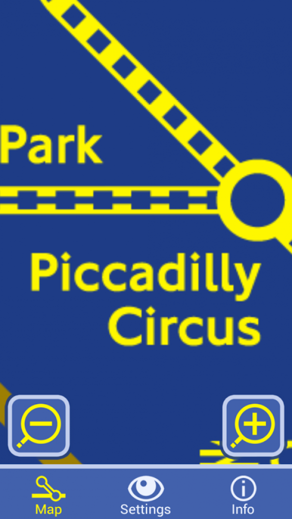
The existing black and white map is actually left over from the time before colour printing became cheaply available, it isn’t actually designed for colour-blindness, so the first enhancement was to produce something that was actually tailored to that audience, that combined colour with pattern to create something ideally suited to people who see in a restricted palette.
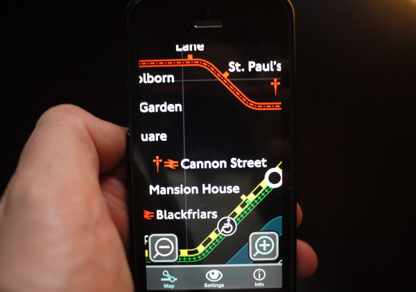
Additionally, due to our past experience working on video magnifier software, another use soon became apparent. A pattern based map is free from being constrained by colour choice, meaning those colours can be altered to suit the preferences of people with a wide range of different vision impairments. So we used some principles from the video magnifier industry, namely different proven colour combinations (colour on white, colour on black, white on black, black on white, yellow on black, yellow on blue) combined with a very high level of zoom, to go beyond colourblindness and allow additional modes for other types of vision impairment.
User Experience
When developing assistive technology it is important to remember that you are not developing software or hardware for an impairment. You are developing for people who have an impairment. So as impaired vision is so strongly tied to age and more likely to go hand in hand with other minor-moderate impairments, it was essential for us to make as many other considerations as possible. These include larger than usual buttons, choice of font size, simple clear literal iconography, and easy tap controls rather than complex pinch/zoom.
The approach that we took is an example of the benefits that digital technology has been able to bring to all kinds of impairments. The tube map in the station is a physical object that has to compromise to work for as many people as possible, but digital products do not have the same constraints. Interfaces can be customised, the best solution tailored to each individual’s need.
There are some simple basic principles that are applicable to all map design, and we’ve had interest from the cartography community. Using symbol/pattern as well as colour, or providing high detail imagery that can in turn support a high level of zoom; these are things that are applicable to all maps.
So we hope that these principles might be taken up by other designers, spreading the word about universal design, and removing the unnecessary barriers that make it more difficult for people to live their lives as comfortably, independently, and equally as possible.
Project Marketing
As the app is free, we have no marketing budget. However due to the public service nature of this app we were fortunate enough to gain the services of a marketing company free of charge, which helped greatly with initial coverage, including a print article in Web User magazine.
We have also spread word through specialist channels, in both the mapping/cartography(GIS) community, including an interview for the British Cartography Society's quarterly journal, the accessibility community, such as a guest blog post on the deafblind.org website, and the travel industry, both locally and nationally.
Project Privacy
The app is a simple resource, with no data entry involved. We do not ask for, track, use or store any personal data.
Travel & Tourism
This category relates to applications dedicated to travel and tourism services and information.
More Details