CHEP Rebrand
Graphic Design - Identity and Branding
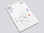
CHEP is one of Australia’s quiet achievers. It does business today in 52 countries and is best known for its ubiquitous blue shipping pallets. In recent years CHEP has been scaling up by purchasing other reusable packaging companies that serve different industries to its own. We needed to find a smart way of folding these new businesses into the CHEP brand. To start thinking as one team, without losing each brand’s valuable frontline industry expertise. So we drew the many businesses together around a shared promise to customers – to help them to chase higher supply chain performance. Yet at the same time locked in the acquired industry expertise through CHEP branded industry solutions. The new identity system helps the greatly expanded CHEP family to look and act as one. A lengthy rebrand process is now well underway, to align the business and its multiple divisions to the new identity. To date the Aerospace, Automotive, Industrial and Pallecon divisions have implemented the new identity globally, with further divisions to follow
Real Change
Graphic Design - Publication
To create a new dynamic identity for the internal communications part of Principals branding
Coffey rebrand identity refresh
Graphic Design - Identity and Branding
Every Coffey relationship is built on trust.
Whether it’s in geosciences, project management or international development. Trust that’s hard-earned through proven expertise, depth of global experience and commitment to stay one step ahead.
They have a united group of specialists – many of whom number among the best in the world and take enormous pride in collaborating with Coffey’s project partners. By digging deeper. Thinking smarter. And seeing further. All so they can deliver the smartest solutions, every time. As Coffey has grown, there have been many changes to their people, clients and the market. Coffey has developed a new strategy to regain their market leading position.
In 2012 - based on feedback from global research with their clients and people, they have simplified their business structure by moving from a sub-brand to master-brand strategy. They now position themselves through their masterbrand – Coffey. They have developed a new brand strategy, which includes a new positioning, vision, client promise, behaviours, verbal and visual identity.

WongPartnership Brand Identity
Graphic Design - Identity and Branding
WongPartnership has achieved an extraordinary thing – being counted and recognised as one of the top 4 law firms in Singapore in just 20 years. By comparison, two of their major competitors have been around for over 100 years. They have consistently challenged the major players and have strong ambitions to become the leading firm. 
Coolum Residences
Graphic Design - Identity and Branding
Capture the experience of the resort - and transfer it to the residential development, positioning it as luxury living within the natural beauty of the environment – without being confused for the resort itself.
Ten Connect
Graphic Design - Identity and Branding
The way in which major advertisers (and their media agencies) choose to engage with top tier media companies is changing. In a highly fragmented media space, advertisers are increasingly open to brand building ideas created and aggregated by media owners across multiple platforms, to surround target customers with relevant brand messaging across the day parts. Network Ten and it’s partners Eye Corp Outdoor, DMG Radio Australia formed a cross platform consortium called Connect which required a differentiated and powerful brand strategy and identity
The Institute for Creative Health Identity
Graphic Design - Identity and Branding
To create a new name and brand identity to stand out amongst other players in their sector


.png)


