

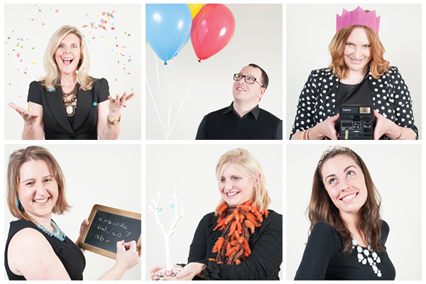
Image Credit : Team Photographs taken by Jessica Lindsay.
Launch party Photographs taken by Stecey Poson (SAAS Exclusive Images Studio)
Portfolio images by the WRD team.

Project Overview
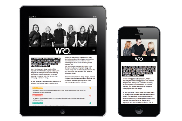
White River Design celebrated 10 years in business in 2013, providing the perfect opportunity to reposition our brand. In line with our transformation from solely graphic design into a complete creative studio, we recognised the need to move to a more contemporary, innovative and transformative brand that reflected our evolving culture and commercial development.
White River Design has long been a catalyst for change in other businesses, conceptualising and creating hundreds of individual brand identities. Based on our own brand personalities of The Magician and The Creator, we morphed our brand to the acronym WRD.
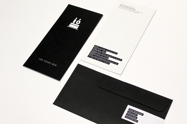
Using our birthday celebration as the launching pad for the rebrand, underpinned by the concept of turning ‘Ten Years New’, we threw a birthday party strategically designed to celebrate and showcase our evolution and expertise as a multi-faceted studio.
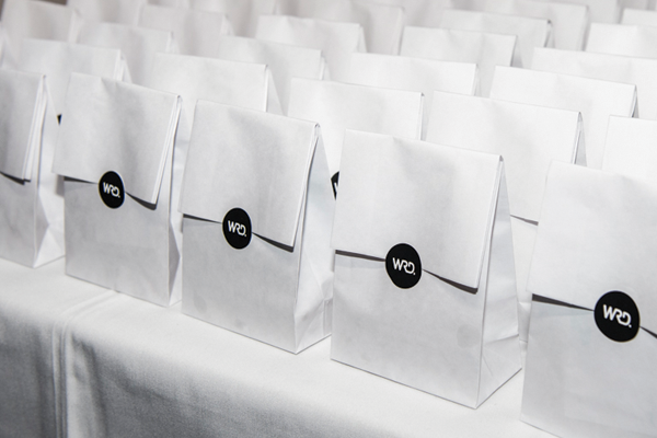
The strategy was to throw a typical birthday party–with balloons, party games, birthday cake, lolly-bags and the singing of ‘happy birthday’. The theme was black and white to tie in with our new brand, and we entwined our brand personalities system into our party games, engaging with clients while simultaneously reinforcing the branding and identity system that is unique to our studio.
Organisation
Team
Debbie O'Connor - Creative Director
Kirsty Pascoe - Graphic Designer / Project Manager
Marnie Tomczyk - Graphic Designer
Nadia Kerr - Web Developer
Project Brief
Our team brief? To create a brand that would create intrigue and visually stimulate. That would capture the audience’s attention, and reflect our brand personalities of The Magician and The Creator. That would represent creativity, vision and adaptability.
The logo itself had to act as a mark as well as a stencil, enabling further transformation and evolution to deliver brand longevity over time. The application of colour was to be used to add interest and surprise, to play on the concept of evolution and change rather than be set and conformative.
Our launch was integral to the brief - linking our birthday celebrations to the rebrand was always a strategic decision. The aim was to recognise our growth and development from a graphic design business into a complete creative studio, and for suppliers and clients to see this integrated with our evolution as a brand. The final element of the brief was to ensure that our Brand Personalities system that we use internally was integrated within the rebranding and communicated via the launch. Unknown to those outside of the studio, the system is central to our positioning as a market leader in corporate and strategic branding.
Project Need
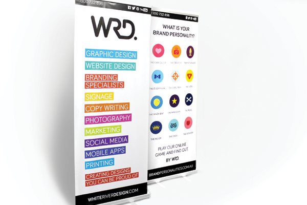
When developing a brand, we use a system based on the philosophies of Carl Jung's Brand Archetypes. We build brands with personality, and as this is a point of difference we ensured that our rebrand focussed on these principals.
The WRD Brand Personalities System has been developed over a number of years and facilitates the use of word association to determine personality traits of the brand. For centuries stories have been told of heroes that save the day and magicians that turn dreams into reality; story-telling remains as prevalent today as it ever was, so our Brand Personalities system provides a method of developing a brand that tells a specific story. It not only enables us to accurately develop a brand in line with the central philosophy of the business, but also positions the client as central and active within the brand development, rather than passive.
We performed this exercise internally - out of the 12 brand archetypes, we discovered that our brand personalities are The Magician and The Creator. This formed the basis of our logo development.
We then brainstormed how we could make this system accessible world-wide. We created an online brand personalities test for international adoption by both potential clients and professional designers.
Linking our Brand Personalities with our rebrand was both conscious and strategic – WRD is now representative of both the brand archetype as a tool for brand development, and the studio’s positioning as a catalyst for change and transformation.
Design Challenge
Our biggest challenge was to produce the rebrand alongside all of our paying projects. It was challenging to set aside time to collaborate, brainstorm and strategically conceptualise how this vision was to come together in a cohesive and believable brand.
We planned time each week for members of our team to get together and work on the brand. Not being a large studio, we weren’t able to dedicate staff solely to this project. In addition, our budget had to be front-of-mind so we had to focus on the essential elements that we needed to get our new brand launched.
Our other challenge was that we had to work on three concepts; the rebrand, the Brand Personalities, and the birthday party, and develop them in a manner that would make them look individual yet tie them together as part of WRD, and ensure they are instantly recognisable as part of the same family.
Again, this was done collaboratively via a tight brief, a shared commitment to effective project management, and careful planning as to not only where WRD is now, but also where the team plans to take it in the future.
Sustainability
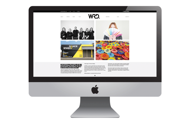
The large proportion of our rebrand focused on our digital footprint; as a business, WRD actively pursues a print minimalist philosophy. Where we did print work, we used Australian owned and operated companies.
Part of our ongoing business operations is undertaking due diligence with our supplier partners. We have taken great care to source printers that utilise environmentally-friendly initiatives that includes energy-efficient factories, waste minimisation, elimination of water on the press, the avoidance of environmentally-harmful chemicals and, of course, using sustainable or recycled paper.
Internally, all brainstorming and development work was done via a whiteboard and on-screen, and printing was kept to an absolute minimum. This business commitment has developed our ability to view layouts and graphics on-screen and interpret them as they would appear in print.
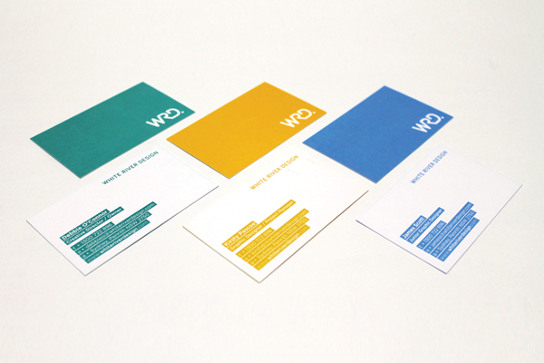
For our business cards we chose an uncoated stock that is an FSC Mix Certified paper – we ensured that all pulp is derived from well-managed forests and controlled sources. It is not only elemental chlorine free, but is also manufactured by an ISO 14001 certified mill. Our inks are also vegetable and soy-based, rather than mineral based.
Interestingly, our commitment to ‘working clean’ is reflected in our brand – WRD is clean and untainted, with the un-essentials stripped away. Pure and simple.
Marketing - Brand 360
This award celebrates creative and innovative solution and strategic design for overall brand presence and identity. Consideration given to all aspects of brand experience and identity, including message delivery user experience, and engagement.
More Details