


Project Overview
Every Coffey relationship is built on trust.
Whether it’s in geosciences, project management or international development. Trust that’s hard-earned through proven expertise, depth of global experience and commitment to stay one step ahead.
They have a united group of specialists – many of whom number among the best in the world and take enormous pride in collaborating with Coffey’s project partners. By digging deeper. Thinking smarter. And seeing further. All so they can deliver the smartest solutions, every time. As Coffey has grown, there have been many changes to their people, clients and the market. Coffey has developed a new strategy to regain their market leading position.
In 2012 - based on feedback from global research with their clients and people, they have simplified their business structure by moving from a sub-brand to master-brand strategy. They now position themselves through their masterbrand – Coffey. They have developed a new brand strategy, which includes a new positioning, vision, client promise, behaviours, verbal and visual identity.
Project Commissioner
Project Creator
Team
Principals - Tui Horo - Account Director; Helen Spoor- Account Manager; Hayden Matthys - Finished Artwork; Gabriel Mello - Designer; Simon Wright- Creative Director; XXVI- Language;
Project Brief
Principals were engaged to develop a new verbal and visual identity that would demonstrate a modern and differentiated brand. The new brand identity signals a change for Coffey, allowing the opportunity to reposition themselves ahead of their competitors.
Project Need
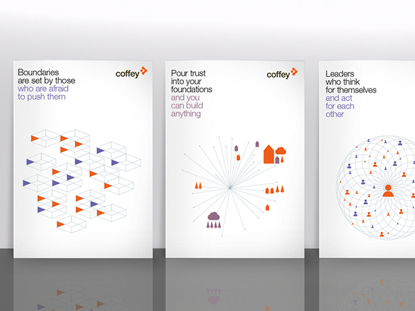
A fresh, unique identity has been developed that puts the strategy at the core. The identity is led by a strong tone of voice built around key headlines that bring the positioning ‘finding smarter solutions’ to life and reflect the content of the communications.
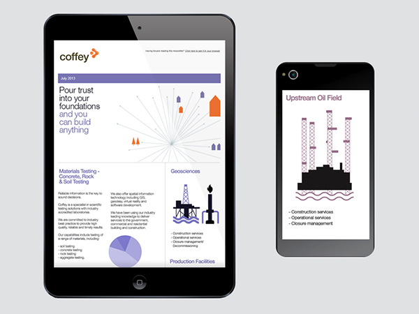
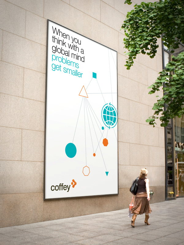
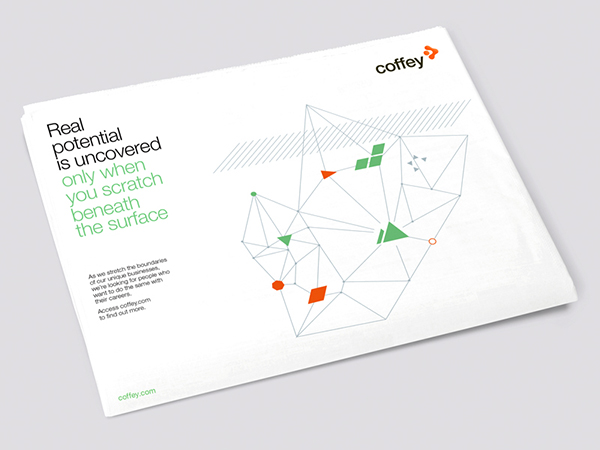
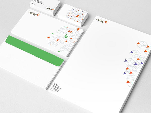
The colour palette uses the primary original Coffey Orange – with a set of five secondary colours. The visual identity uses an abstract primary illustrative style that reflects the geometric, technical and precise elements of the industry as line patterns. The individual icons represent the core elements relevant to particular aspects of the business, from technology to people. The illustrations are used in combination with the headlines leading as the key message. This visual identity was designed to be flexible, adaptable and with movement in mind to be executed across digital formats and large scale.
Design Challenge
The challenge was to develop a master brand identity flexible enough to be used across a variety of capabilities, geographies and industries.
The headlines demonstrate Coffey’s unique capabilities based around their core positioning and client promise – supported by an illustrative style that provides a unique visual identity to help them stand out from their competitors.
The primary imagery is supported by infographics and photography that details what Coffey does in a visual way.
Developing a series of template materials to meet a variety of needs across a global business can often be a challenge. The new visual identity allows flexible use across multiple communications channels. The visual identity has the ability to continue to demonstrate flexibility and evolve along with Coffey.
Sustainability
As part of the brand identity development, Coffey is evolving towards a digital business. They are choosing not to reprint a variety of original print materials and instead move to an online system.
Graphic Design - Identity and Branding
This award celebrates creative and innovative design in the traditional or digital visual representation of ideas and messages. Consideration given to clarity of communication and the matching information style to audience.
More Details