


Project Overview
Scope is one of the largest providers of disability support in Victoria operating in 99 service locations. It is also one of the largest not-for-profit organisations in Australia. Prior to 2001, the organisation was known as the Spastic Society of Victoria.
Project Commissioner
Project Creator
Team
Grace Richards, Rhett Luciani, Kate Gordes, Allan Pope, Kurt Smith, Amy Yang, Matt Agar, Steve Thompson, Rowan Barnes.
Project Brief
Scope recognised that it was the right time to refresh their brand. They wanted to reflect their commitment to support people living with a disability as they move through the different phases in their life.
At the same time, changes to funding under the National Disability Scheme (NDIS) called for Scope to revise their approach and become NDIS ready.
With participants now having greater control over their funding, Scope wanted to ensure these people could access all the information they needed, particularly on services and funding that is available to them. Our aim was to ensure this information was easy to find and understand.
Project Need
Scope asked us to deliver a website to bring this new brand to life. There were four key areas to the project that provided evidence, insight and guidance: understanding the people that use the site; designing for a range of abilities and types of people; ensuring the highest level of accessibility and usability through application of the WCAG guidelines; and testing our assumptions early and vigorously with real people.
User Experience
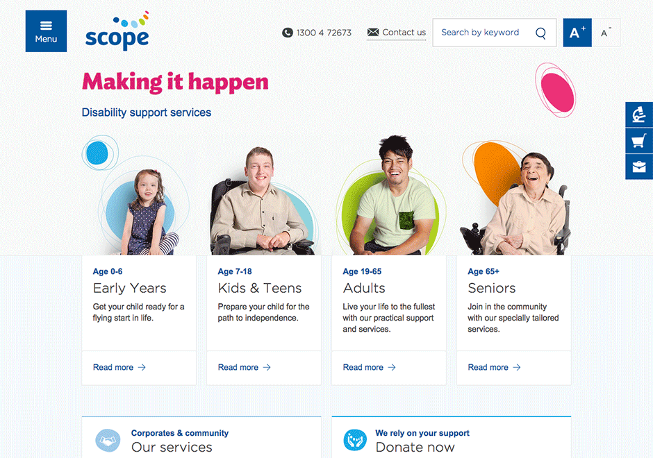
The age categories became a focus in the design of the website. As soon as you arrive at the homepage, you can filter the information by selecting which age group you belong to.
The content is filtered so you receive the information that is relevant to you. People don’t need to sort through pages and pages of content to find what is relevant to them.
The design of the website incorporates the look and feel of the new Scope brand. In particular the ‘stone pathway’ represents a person’s life path. The ‘pathway’ theme is carried through the site.
The design is welcoming, with a real, human approach that’s a bit of fun. The photography uses real Scope participants as the subject.
Throughout the content pages, key information – such as contact details or calls to action – are highlighted and easy to find. Again, this design element was a direct result of the findings in our persona analysis and user testing.
The website is Level AAA in most parts and Level AA where AAA was not possible. We rigorously tested font sizes and usage to meet the guidelines.
Digital - Community
This category is all about helping our communities to connect and engage, from emergency services to Not for Profits to social groups, these apps and sites not may not only assist in delivery but also create efficiencies providing those at the coalface more time to do their important work whether it be fighting fires or managing the local team. It's not all serious though we're also looking for projects that work to help bring the community groups together with fun and enjoyable activities.
More Details