


Image Credit : Freya Robinson (CC2c)

Project Overview
The discount department store Target, began repositioning its core business and brand several years ago, focusing strongly on areas that customers would notice most- it’s product offering and store design. To introduce differentiation and the element of surprise Target contracted CC2C to conceptualise striking new design and signage elements such as in-store pop-ups and display points that would visually POP and attract attention.
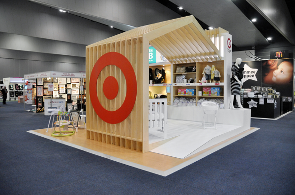
Designed by CC2C for Target to launch the ‘Mum’s Hub - Baby’ department at the 2015 ‘Pregnancy, Babies and Children’s’ Expo this installation is bold, inclusive and flexible; and is a confident modern statement that lifts Target’s profile and its engagement with contemporary families. Inspired by the tiny houses movement the pop-up shop, in the iconic shape of a house, welcomes customers to imagine their own family in a home situation.
Project Commissioner
Project Creator
Team
Marketing Manager & Brand Rep; Olga Milionis (Target Australia)
Creative Director: Paul Bonnici (CC2c)
Art Director / Designer: Claude Marcos (cc2c)
Draftsperson: Freya Robinson (CC2c)
Visual Merchandising: CC2c
Build and Install: Onset Arts
Project Brief
The ‘contemporary family Mum’ is at the heart of the Target brand. Customers already equate the Target brand with value but have little expectation of encountering a superior experience. To change the customers perception of the brand and product offers we needed to elevate the customer experience, and surprise the customer by offering superior merchandise in an engaging retail environment with product that was still inherently good value. The brand’s value proposition “higher quality, lower prices”, was key to the design strategy.
We were inspired to design the concept for the 5-day promotion around the tiny houses movement as an engaging reference to small-space living. The concept presents the Target home as theatrical provocation, leaving room for shoppers to imagine their own home and family.
Project Innovation/Need
This installation positioned shopping at Target as part of a larger experience, part of a journey. To deliver a differentiated shopper experience we placed importance on clear sightlines, and ensured that the installation was accessible yet integrated into the site. We applied retail theatre to a temporary setting appealing to customers through all their senses, inviting surprise and attracting attention in ways that traditional Target promotions had never attempted.
Our design
1) enabled the iconic house silhouette to become a theatrical device for Target’s family vision, uniting concepts of family, mum and home.
2) of functional, flexible fixturing meant the pop-up couold be ‘re-dressed’ for new seasonal promotions, which meant the cost was amortised over the lifetime of the units.
3) ensured the flat-pack modular construction was completely versatile. The units could easily be adapted in future to suit a broad range of site constraints, were quick to dismantle and reassemble, and fitted onto 3 double pallets which were easy to move and store.
Design Challenge
The issue always with promotions or pop ups in the middle of large format retail spaces like Target is how to engage customers without interrupting normal traffic flow or the layout and management of nearby product categories.
Our choice of a crisp, clean aesthetic featuring Scandinavian-inspired timber framework and white finishes ensured the product remained the hero in the subtle, sophisticated palette. Fixtures faced customer traffic flow laneways, which maintained a logical layout. Inserting a change in floor level and the use of free-standing plinths anchored products without blocking sightlines. Customer engagement is delivered at shopper touch points through clear points-of-sale and focused visual merchandising. Illuminated signage defines the store offerings, while captivating imagery and bold colours provide personality. Repetitive elements created impact.
The modular timber units are designed to bolt together, meeting the challenges of sustainability (reuse and repurpose), flexibility, durability, and ease of dismantling and re-assembly.
Sustainability
Our policy at Create and Communicate 2C is at all times to reduce reliance on materials that cannot be recycled or reused. We seek out and work with suppliers who think the same way we do.
In this project, to reduce the carbon footprint, timber used in construction is local mountain ash which is a farmed renewable resource; the units were specified in locally made laminate and low voltage LED lighting was used to also reduce the energy requirement. Paint finishes were specified in environmentally friendly paint.
The entire structure is demountable, is planned to be reused and repurposed for seasonal or special promotions. This ensures the longevity of the unit, and amortises the cost over a lifetime rather than single use.
Storage size is kept to a minimum, saving the client storage costs. The unit fits on 3 double pallets.
Pop-Ups, Display, Exhibit & Set Design
This award celebrates innovative and creative design for a temporary building or interior, exhibition, pop up site, installation, fixture or interactive element. Consideration given to materials, finishes, signage and experience.
More Details