


Image Credit : Arkadiusz Rejman
Project Overview
"Making fashion, style and quality affordable since 1925", department store chain Target Australia enjoys strong brand awareness and heritage, with over 300 stores across the country. On a mission to prove value retail can go hand-in-hand with inspiring customer experience, the Australian retailer approached us with a means to overhaul its stores and branding as part of this step-change.
Quality, community and inspiration are the hallmarks of our new store concept – a bold departure from the homogeneous supermarket-style formats of most value retailers. We added a raft of new services, from clothing alterations to self-service t-shirt printing, as well as the first-ever Target café inspired by Melbourne’s cool coffee shop scene.
Project Commissioner
Project Creator
Team
Tim Graveling - Design Director, Interiors
Sarah Hopkinson - Senior Designer, Interiors
Simon Parkes (Design Director, Graphics), Jo Randall (Design Project Leader, Graphics), Dutch Holland (Graphic Designer) James Kay (Middleweight Designer, Graphics)
Project Brief
The radical change is immediately evident in the façade, where a digital screen lets the brand talk through moving image and in place of the retailer's name, there’s simply the iconic Target 'bullseye' logo. This confident statement plays on strong brand awareness and heritage that Target has in the Australian market.
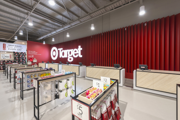
The transformation continues inside the 58,000sqft store, with a sleeker, more spacious 'white box' environment and raft of new services, from clothing alterations to self-service t-shirt printing. The brand's signature red shade is used more sparingly as a beacon for signage and service areas.
The café is branded as a distinctive stand-alone destination, with illuminated black and white signage, while the departments are given their own distinct identity through bespoke design features and evocative lifestyle images.
Project Innovation/Need
One of the most exciting additions is the first ever Target Café. Inspired by Melbourne’s wealth of cool independent coffee shops, it’s branded as a distinctive standalone destination with illuminated black and white signage, while also complementing the wider store environment.
Each of Target's six departments (Women's, Men's, Kids', Baby, Home and Digital) is introduced with a curated VM display of products from the section and is given its own distinct identity via bespoke design features. For example, patterned fretwork screens create a sense of privacy and femininity in Lingerie, while colourful play areas appear in Kids'. Across the display fixtures, inspiration meets value as evocative lifestyle images sit alongside clear price signage.
In line with the new store concept at Frankston, we have transformed the Target logo from the heavy, condensed typeface with its finite full stop into a finer, softer, more contemporary bespoke font.
Both developments indicate a broader step change for Target Australia across its digital and physical platforms – a warmer, more inviting identity that proves value retail needn't mean an uninspiring customer experience.
Design Challenge
One of the biggest challenges was to design a format that would work across a vast (58,000sqft) single-storey store, something that customers could easily navigate and not be overwhelmed by. Moving away from a homogenous, overwhelming ‘big box’ feel, we aspired to bring more differentiation and character to individual offers within the store, creating points of interest and variation of vista around the floor.
It was also important to maximise the flexibility of equipment to suit different products and categories, and ensure Target’s staff could easily manage it on a day-to-day basis.
We had to achieve this refurbishment of the existing store within a tight budget and structural constraints, phasing its implementation carefully as the client wished to keep trading during the re-fit.
Sustainability
The design is incredibly versatile and economically sustainable for the brand thanks to the fact the kit can be easily updated with new coloured or graphic panels with minimal effort and cost. This is a simple, effective template that offers much longevity and value for the brand, as opposed to being a bespoke site-specific solution with a limited lifespan. Proof of its effectiveness comes in the fact the scheme has been rolled out in many other store locations since Frankston opened, following positive staff feedback on its usability. Therefore its sustainability applies to the Target estate at large as well as the original store location.
In terms of environmental sustainability, we made the decision to invest in LED lighting – a lower energy, longer-lasting solution than traditional Tungsten bulbs.
Interior Design - Retail
This award celebrates innovative and creative building interiors, with consideration given to space creation and planning, furnishings, finishes and aesthetic presentation. Consideration given to space allocation, traffic flow, building services, lighting, fixtures, flooring, colours, furnishings and surface finishes.
More Details