


Project Overview
A nod to the past, and a glimpse of the future. This brand essence brings together two of the elements that make the Toowoomba Region what it is today: strong historical foundations and ambitious investment plans.
It acknowledges the changing face of the region, and celebrates the broad range of influences that have shaped our communities over the years. It spans seasons, crosses the borders of city and country and caters to the needs of young and old alike. This is a brand essence that embodies not only our region, but the people who make it up. It's a brand our community can own and live.
Organisation
Team
Manager Stakeholder Engagement and Communication - Sian Sutton
Coordinator Communications Design - Bekki Fisher
Marketing Officer - Matthew Pailthorpe
Senior Graphic Designer - Amanda Donnelly
Graphic Designer - Peta Mulheran
Agency - Nick Pritchard from Nick Pty Ltd
Project Brief
After the 2011 floods, the Toowoomba Region needed more than sheer devastation to define it. We needed a brand that people could celebrate and connect with; a brand that is moving and feels like coming home.
With rich, engaging community consultation, a new brand for the Toowoomba Region was sought to respect the past, as well as promote the future prosperity of our region. Since the amalgamation of 8 Councils into 1, the community was seeking a sense of unity and cohesion and the rebrand project worked to bring everyone together.
The brand aimed to showcase the unique aspects of each of our smaller communities within the region, whilst maintaining a cohesive brand personality.
There is a strong undercurrent of pride and emotional connection in our region, this brand is more than a new logo and tagline. It represents our community and we couldn't be prouder.
Project Innovation/Need
Through a series of hands-on, interactive workshops, Toowoomba Regional Council engaged over 3,000 staff, local businesses, the agricultural sector, health, education, community groups, tourism and events organisations, arts and culture, as well as everyday residents to establish a brand that would resonate with each of these communities and build a usable brand across a broad range of functions.
Four brand pillars - Diversity, Liveability, Connectivity and Tradition emerged as part of this process and the community were able to share their strong pride and emotional connection to the region.
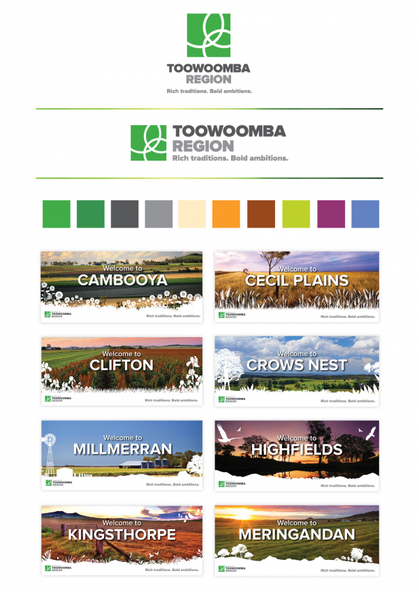
After these communities contributed to the overarching brand, Council worked with over 30 smaller communities to develop unique identifiers to showcase the individuality and rarity of these areas.
Design Challenge
The Toowoomba Region is like a patchwork quilt. It is made up of many different and varied communities that are the fabric of the region and all contribute to the region’s vibrancy and diversity.
Through the rebrand project, key identifiers were determined for over 30 towns within the region. These key identifiers are a great way to show that we’ve listened and are respecting the communities within the region.
The challenge for us was finding a way to showcase these unique identifiers in a way that paid homage to the whole region, whilst maintaining a consistent visual brand. Silhouettes were designed incorporating everything from bales of hay for Wyreema to the scrub turkey for Kulpi. These silhouettes are to be used across all communication collateral, not only for Council, but also for community groups to make use of these assets and promote their unique spirit, voice and vision.
Welcome signs were also designed for every town within the region encompassing these unique identifiers to tell our brand story as residents and visitors explore our beautiful region.
Effectiveness
A brand isn't what we say about ourselves, it's what our community says about us... and they couldn't be happier. From the anecdotal evidence of the community getting emotional as our new brand puts their small town on the map, to the outpouring of love we have received on our social media accounts. We love seeing people take photos beneath our new signs and sharing their #toowoombaregion adventures with us.
By including staff in the process, we can truly live the Toowoomba Region brand from the way we interact with our clients- to the pride we feel as we drive up the range towards home.
We are being noticed nationally and internationally with a brand that has become an economic and tourism powerhouse.
The sentiment has shifted and we're a region to be counted. Rich traditions. Bold ambitions.
Tags
Graphic Design - Identity and Branding
This award celebrates creative and innovative design in the traditional or digital visual representation of ideas and messages. Consideration given to clarity of communication and the matching information style to audience.
More Details