

Project Overview
The most ambitious LGBTQ social networking app in the world designed to empower all gay, lesbian, bisexual, and transgender people.
Project Commissioner
Project Creator
Team
Dawid Woldu, Graphic Designer
Dominik Strzalkowski, Graphic Designer
Lukasz Frankiewicz, Graphic Designer
Project Brief
OUTlife includes features that enable LGBTQ community to easily share their experiences, personal stories, and meet new people in a safe and hate-free environment. It is not just another dating app, but a secure community designed with a strong focus on friendships and mutual support in mind.
When it comes to design, we decided on a neutral color palette, clear iconography, and minimalist typography to enable the users to focus on what’s most important: the content, their experiences, and friendships. Although bold blue and pink are OUTlife's main brand colors, we decided againts using them as the primary app colors. Such a strong and vibrant combination could easily overwhelm the overall look and feel of the application, making the user-geerated content stand out less. We introduced a slightly blue-tinted greyscale color scheme with blue and pink accents representing states and actions.
Due to numerous advantages in terms of development, it was decided that the app will be shipped only for iOS devices with at least iOS 9. This only reinforced the decision to stay with the system font: Apple's brand new San Francisco.
Project Need
Most networks are either aimed at lesbians or gays, and they are all about sex or dating. OUTlife is unique because it focuses on everyday life and the small but special moments experienced and shared with friends, acquaintances, and partners. It’s a completely different approach from the other sites that are out there. But the most important thing is that it is fully inclusive and serves as the network for everyone in the community.
User Experience
Simple, slender, clear iconography
To empower communication among users we designed icon set that makes OUTlife visually unique.
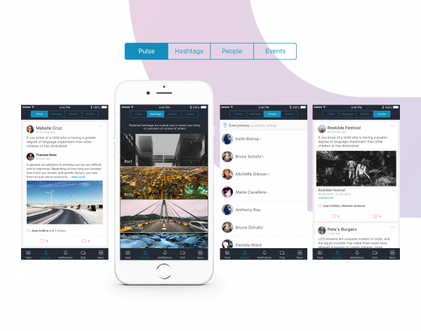
Sharing experiences
The task to create every inspiring story, captured moment, and shared article across the timelines of friends and followers was entrusted to a simple, material design-inspired card.
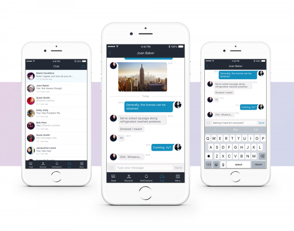
Chit-chat
The unique shape of the chat bubble was something our client had in mind from the start. Constructing a grid for it to rest on was a real design treat.
Project Marketing
OUTlife's marketing strategy includes brand ambassadors, cooperation with bloggers, social media campaigns and PR activities during LGBTQ events. The activites are run by our client, so we cannot go deeper into it.
Project Privacy
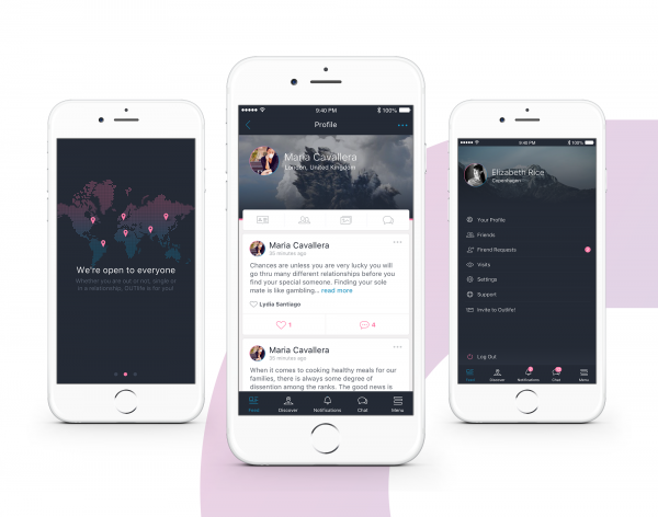
By design and by principle, all data remains safe and private within this secure and free-to-use community and our designs enhance and communicate the resulting feeling of safety and welcome.
User profiles and pictures are encrypted and will never be sold or show up on Google or other search engines. So, no matter whether user is open about their sexuality, single or in a relationship, in OUTlife they are free to be friends with whomever they want and to simply be themselves. OUTlife empowers members of all sexual minorities to meet new friends, find old ones, and grow their LGBTQ network of friendships and mutual support across the entire globe.
Community
Apps more than ever are helping our communities to connect and engage, from emergency services to Not for Profits to social groups, these apps not only assist in delivery but provide efficiencies importantly providing those at the coalface more time to do their important work whether it be fighting fires or managing the local team. It's not all serious though we're also looking for apps that work to help bring the community groups together with fun and enjoyable activities.
More Details